Charts
Step-by-step instructions on how to get started with the Insight Charts
Introduction to Charts
Time series based sensor data charts
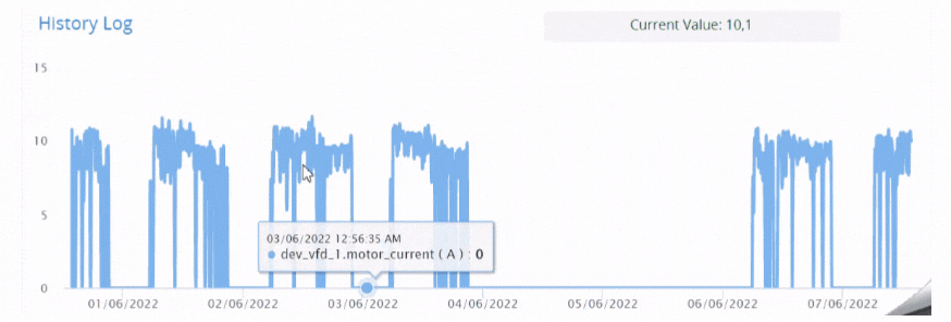
Figure 1: Time series containing numerous data points
Insight uses smart aggregations to visualize all the live data from sensors. These smart charts generally have a two dimensional-data (x-axis and y-axis). Smart data aggregation is generally down stamped time series for visual representation. Most often data is referred to as a time series and you can zoom in to the chart and find the pin-pointed data.
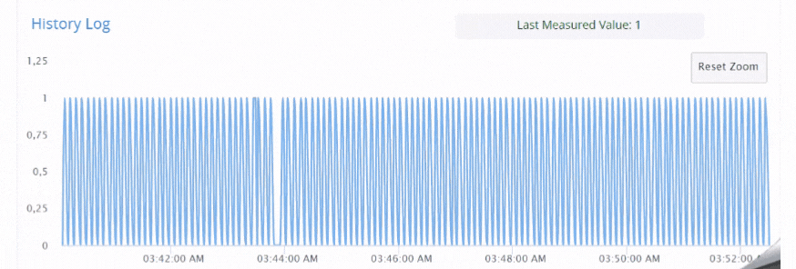
zoom into the figure 1 with the aggregation picker
When there is a huge set of data points, the zoom function and the aggregation picker make it easy to find the exact data point and the information.